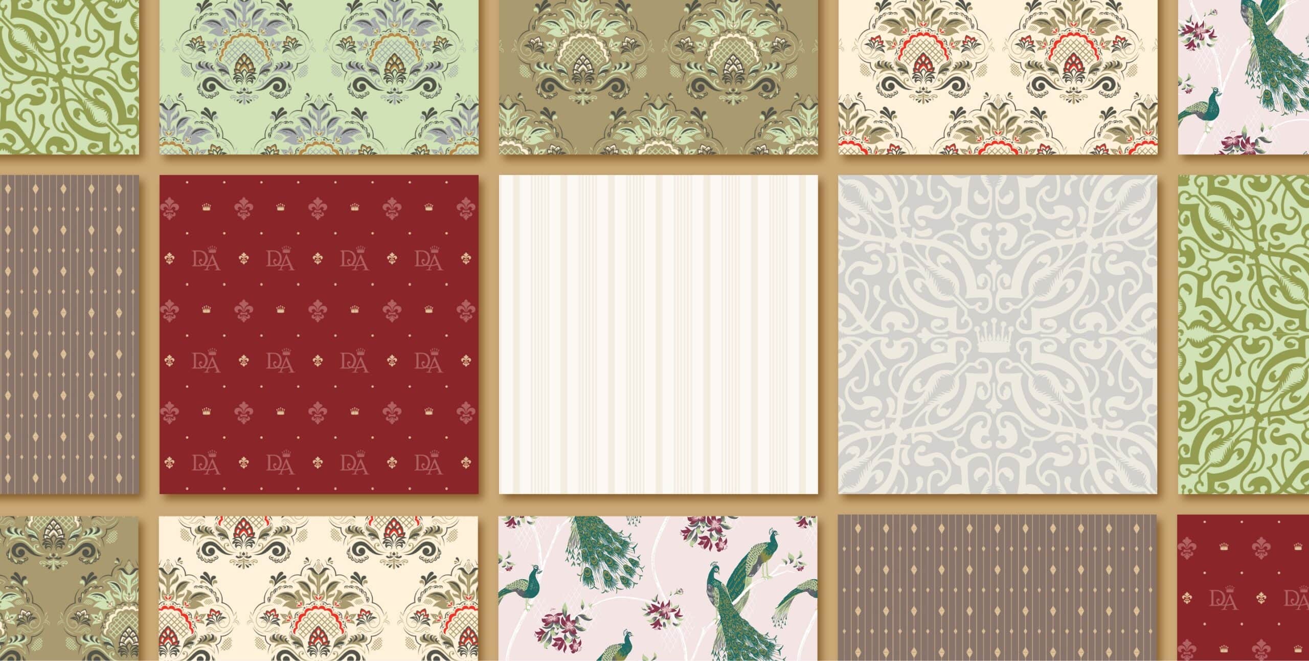
STYLE GUIDE
We set the overall direction of Downton Abbey’s retail presence through the style guide, dozens of pages filled with various licensable artwork, including patterns, borders, icons, and patches. A full suite of inspirational product concepts covered all aspects of the Downton licensing program, conceiving of products that could occupy any and every room in a Downton fan’s home.
NBCUniversal
Downton Abbey Style Guide and Exhibit Campaign
Advertising | Branding | Packaging
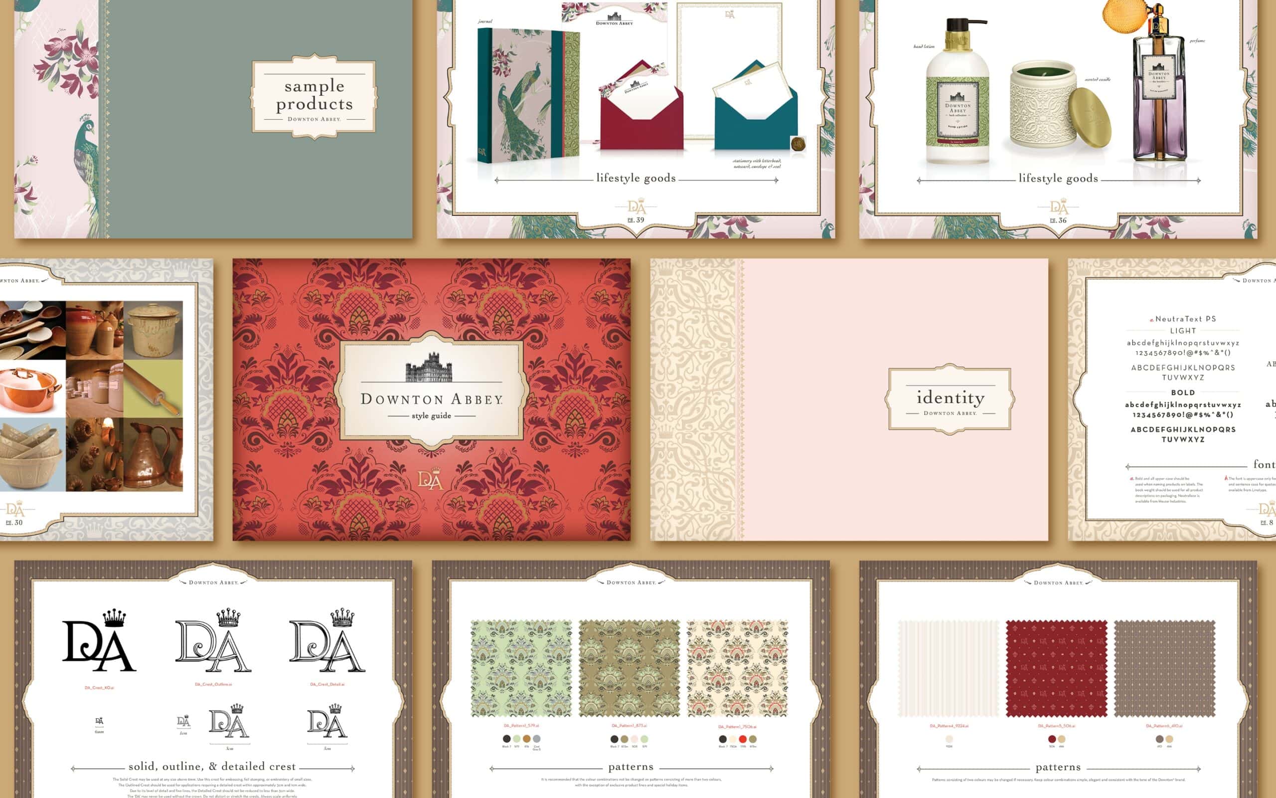
CREST AND ICONS
A new Downton Abbey family crest was created as part of the guide, which was so well received by the showrunners that it was incorporated into the show itself. A diverse set of icons was developed to be used as part of the expansive artwork designed to inspire and excite licensors.
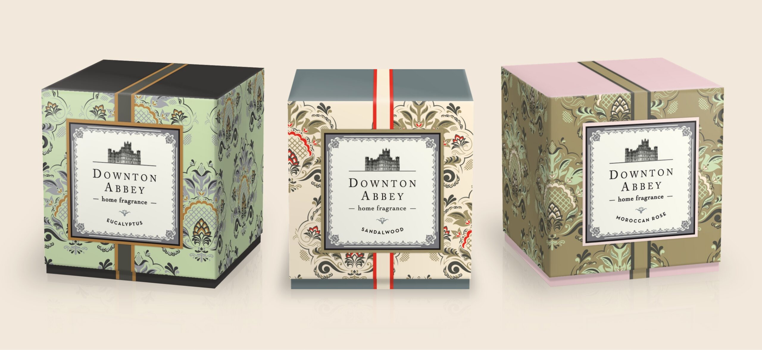
PACKAGING
A range of packaging was designed, accommodating everything from open and closed boxes to hangtags and labels. Each exhibited a classic elegance drawn from the Downton Abbey era.
“From the beginning, SJI’s commitment to understanding our brand and needs was astounding. What’s more, they are really good people, a dream to work with and innately passionate about what they create. The work produced went above and beyond what we could have ever imagined. Suzy and her team are the best at what they do.” Nick Young Senior Manager, Brand Management and Commercial, NBC Universal
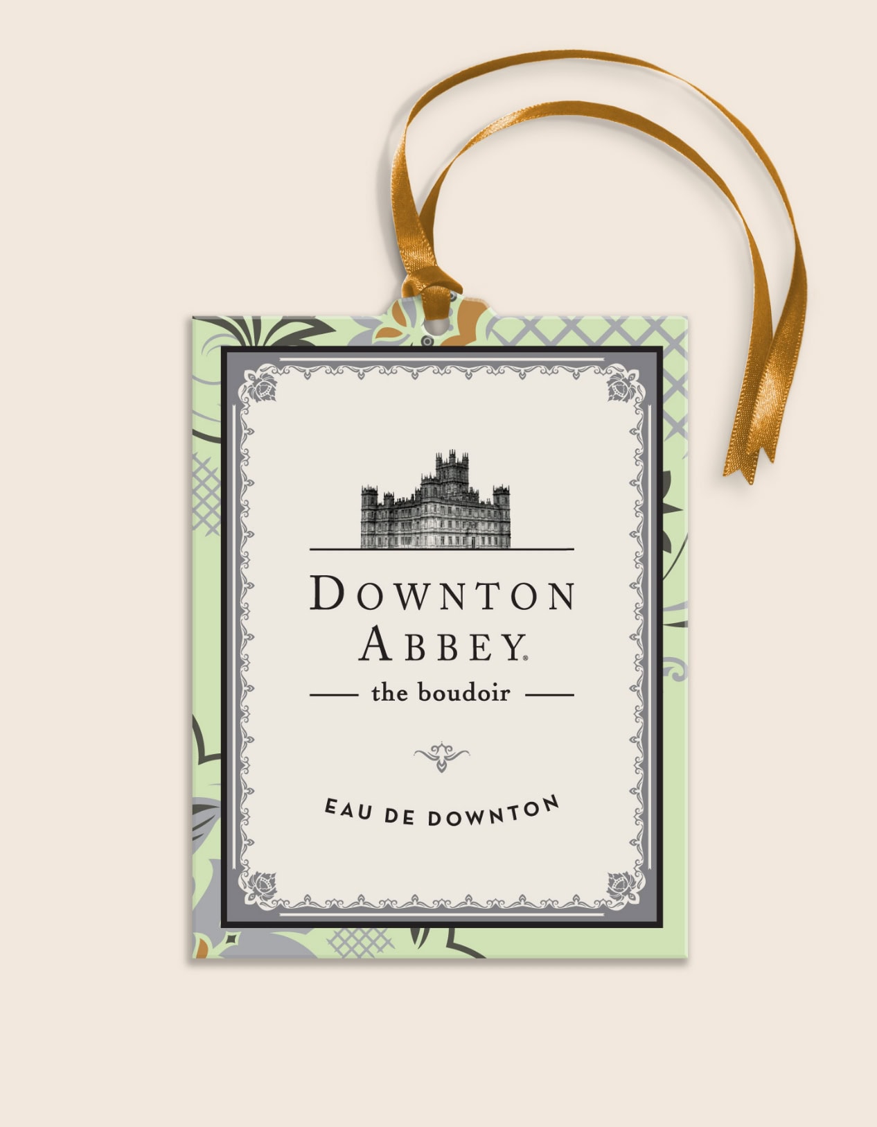
PRODUCT INSPIRATION
For product inspiration, our creative team pulled ideas directly from all aspects of the Abbey. From banquets and afternoon tea to kitchenware and furnishings, we provided a far-ranging selection of ideas, each tied back to the show itself. Sample products were then created, illustrating how the property would work across all relevant categories.
SOCIAL MEDIA
The guide provided social media templates, which PBS and NBCU used to promote the show and new product lines to avid fans worldwide.
DOWNTON ABBEY: THE EXHIBITION
Based on our long history with Downton, we were offered the opportunity to work on the launch campaign for Downton Abbey: The Exhibition. Our challenge was to inspire excitement for the Exhibition while distinguishing it from the television series and movies. We developed unique key art reflecting the elegance of the show and exhibit, built a toolkit allowing widespread use of the branded materials across digital, print, out-of-home media, and signage, and helped develop and launch the corresponding website.
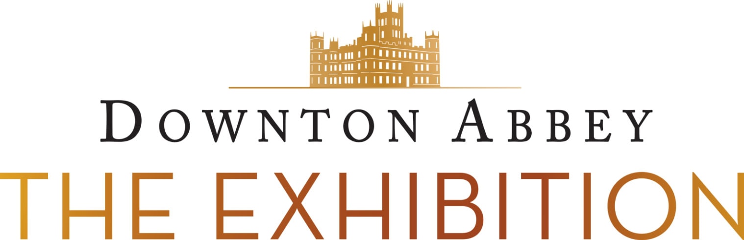
EXHIBITION LOGO
For the logo, we used the instantly recognizable Highclere Castle silhouette from the show as our foundation. Then, we utilized a bold sans serif font for The Exhibition, immediately differentiating it from the show.

MARKETING TOOLKIT
The campaign creative was designed to inspire excitement for this immersive exhibition while distinguishing it from the television series. A toolkit was developed to allow widespread use of the branded materials.
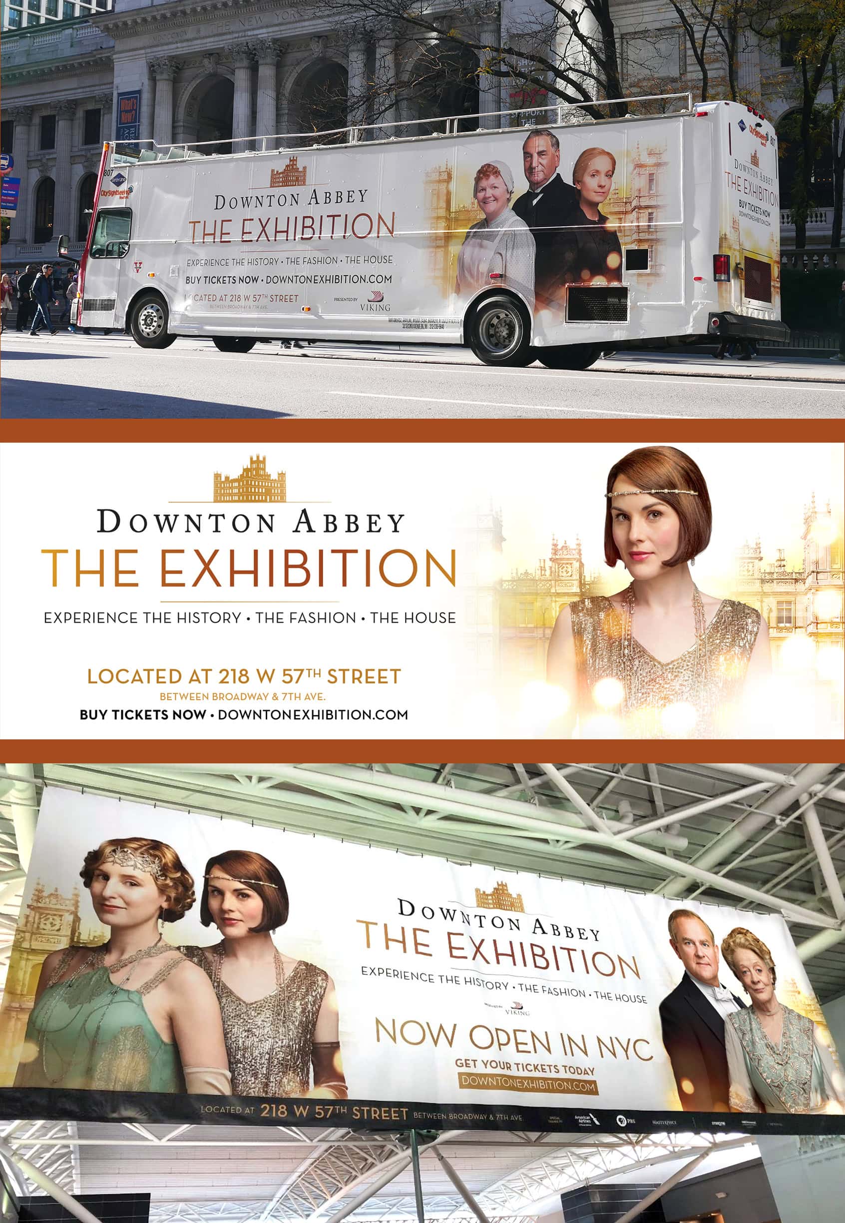
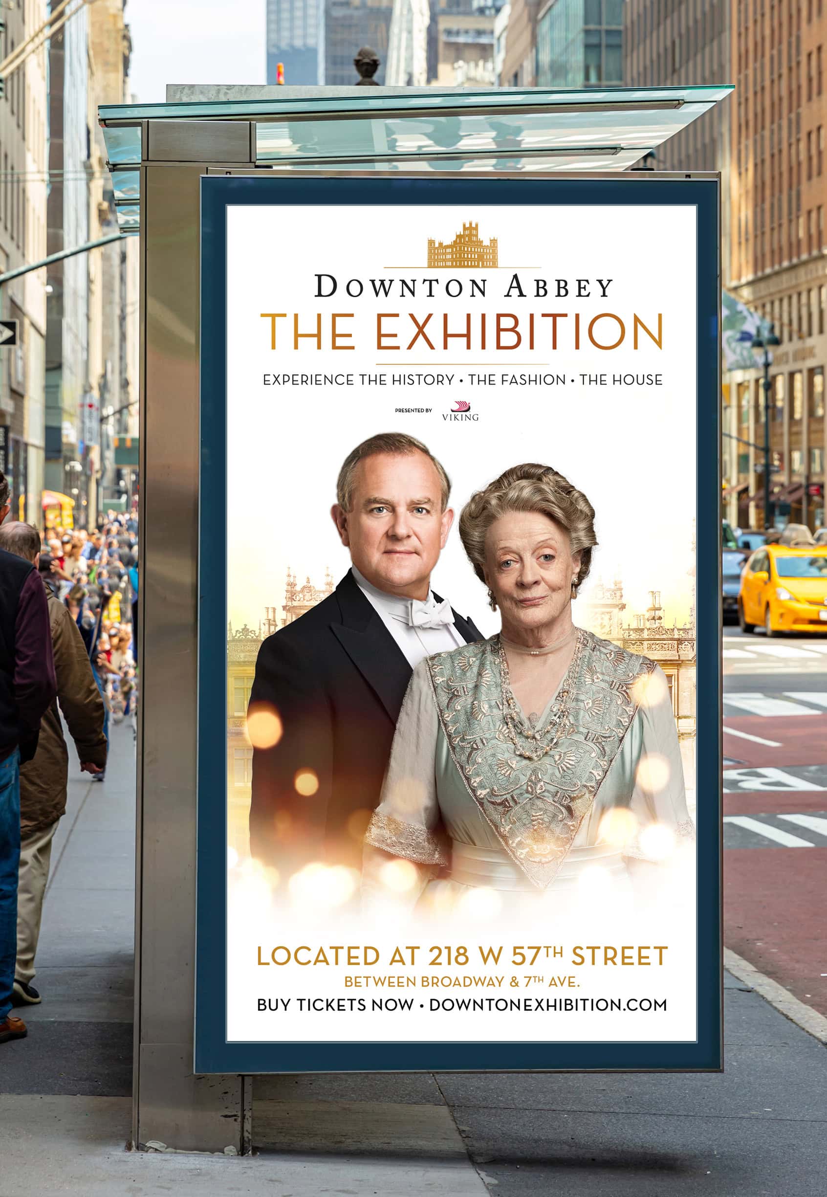
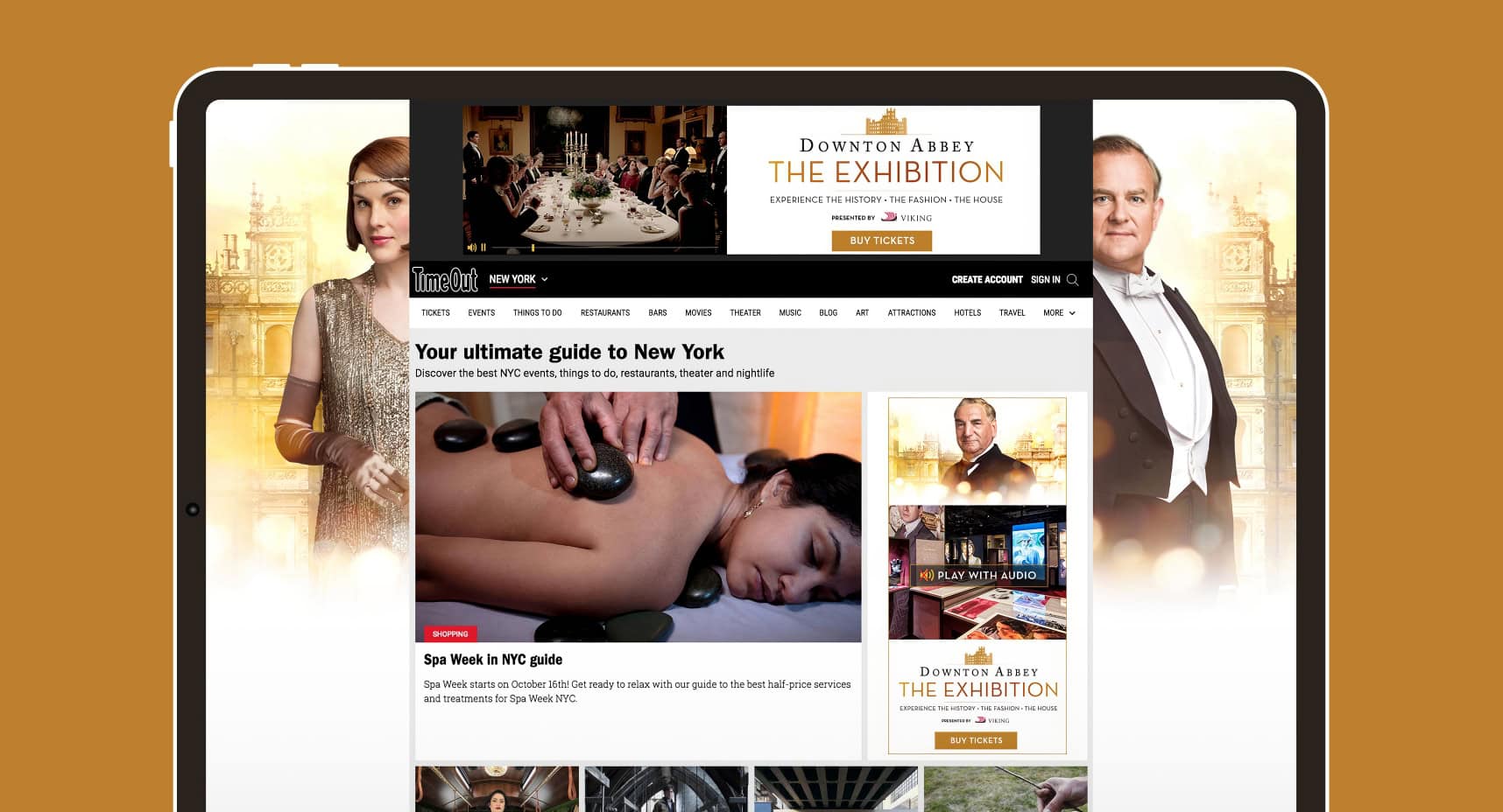
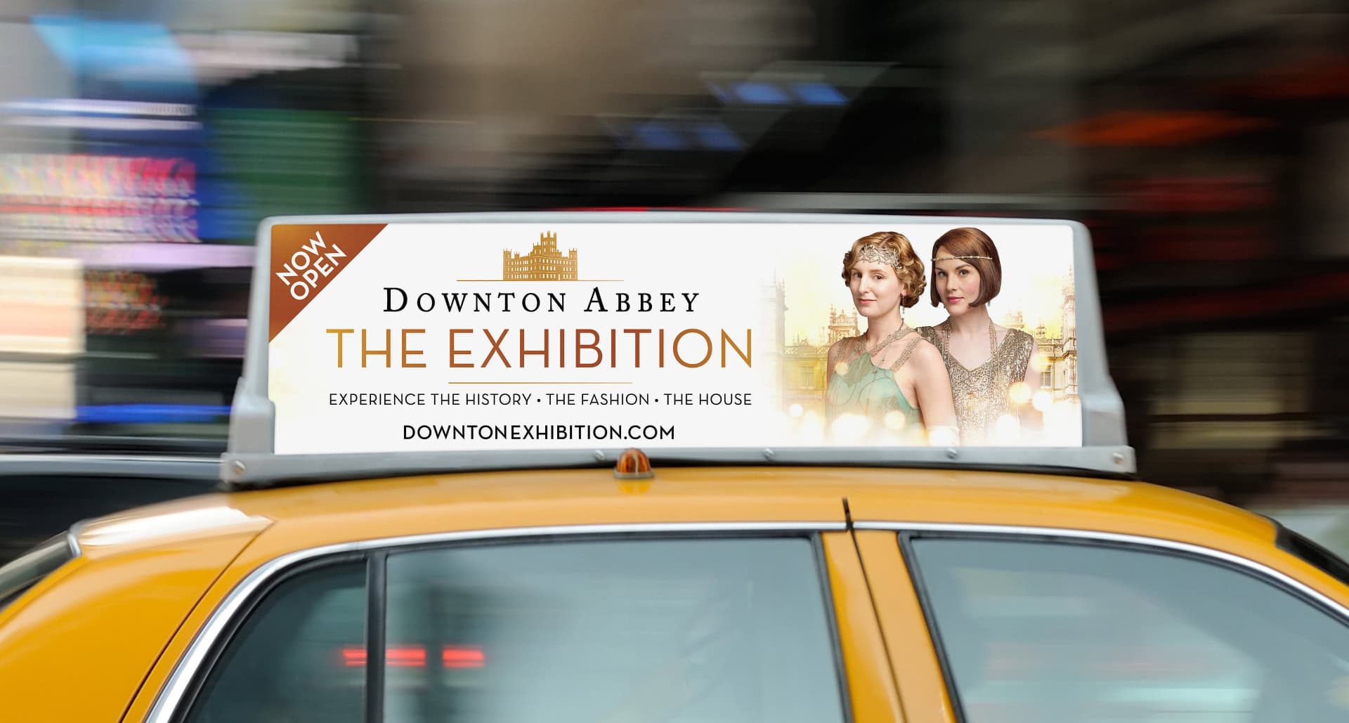
DIGITAL CAMPAIGN
A huge digital and out-of-home campaign was produced, broadening awareness for fans, tourists, and everyone interested in the Downton phenomenon. Special ads were also created targeting the holiday gift-giving season.
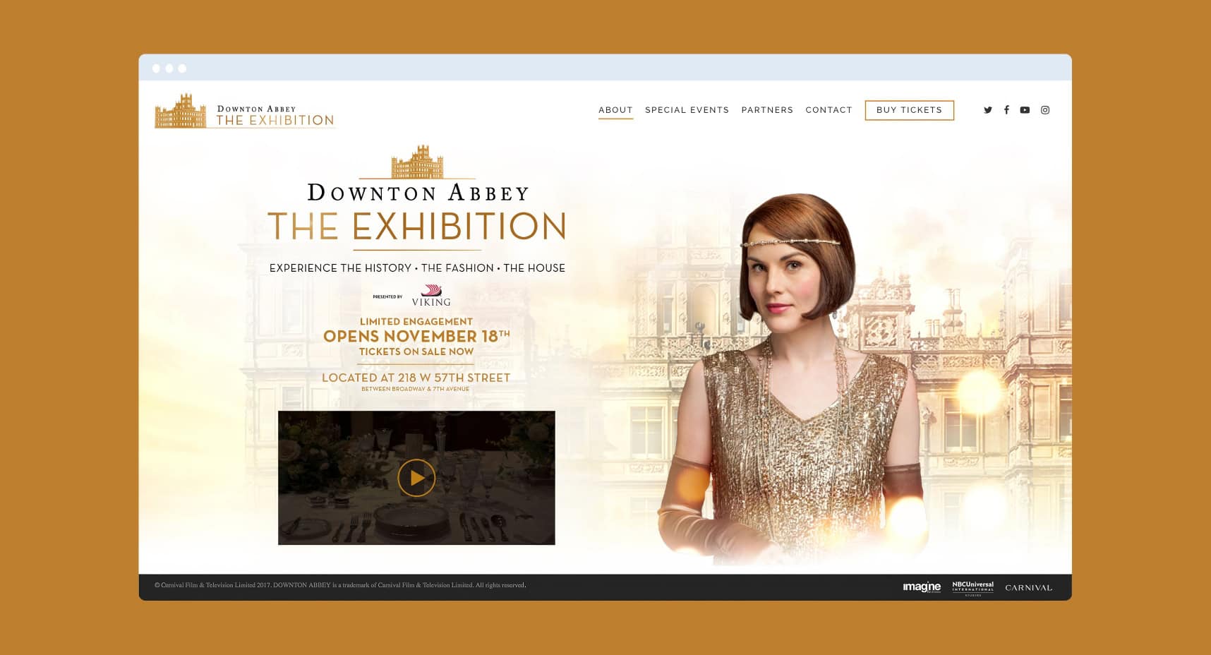
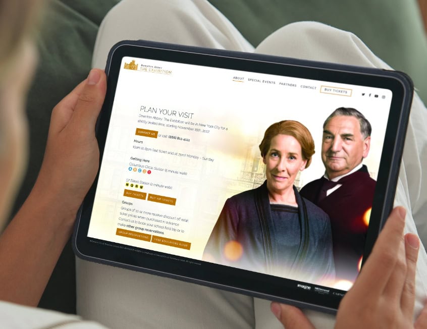
Website Design & Development
The exhibition needed an easily updatable website to provide information for customers and fans. SJI’s elegant design complemented the brand while offering a user-friendly site for people to learn about the exhibition, contact staff for more information, and most of all, to purchase tickets. SJI worked closely with the hosting company to ensure that the site had zero downtime while 500,000 customers visited the site in the first month.
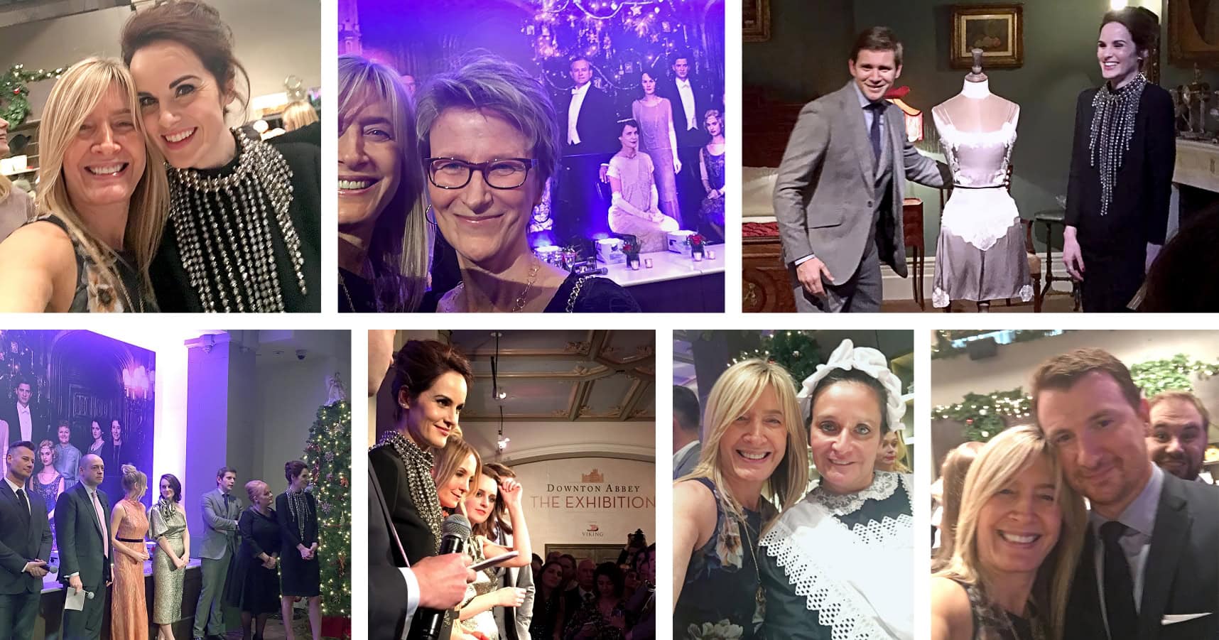
LAUNCH PARTY
The SJI team was thrilled to sip champagne and rub elbows with cast members, including Michelle Dockery, at a gala reception to celebrate the exhibit’s opening.
Though Downton Abbey ended its final season in 2015, interest in the Exhibition is still going strong due, and it continues to tour to this day.