naming, logo, tagline and brand architecture
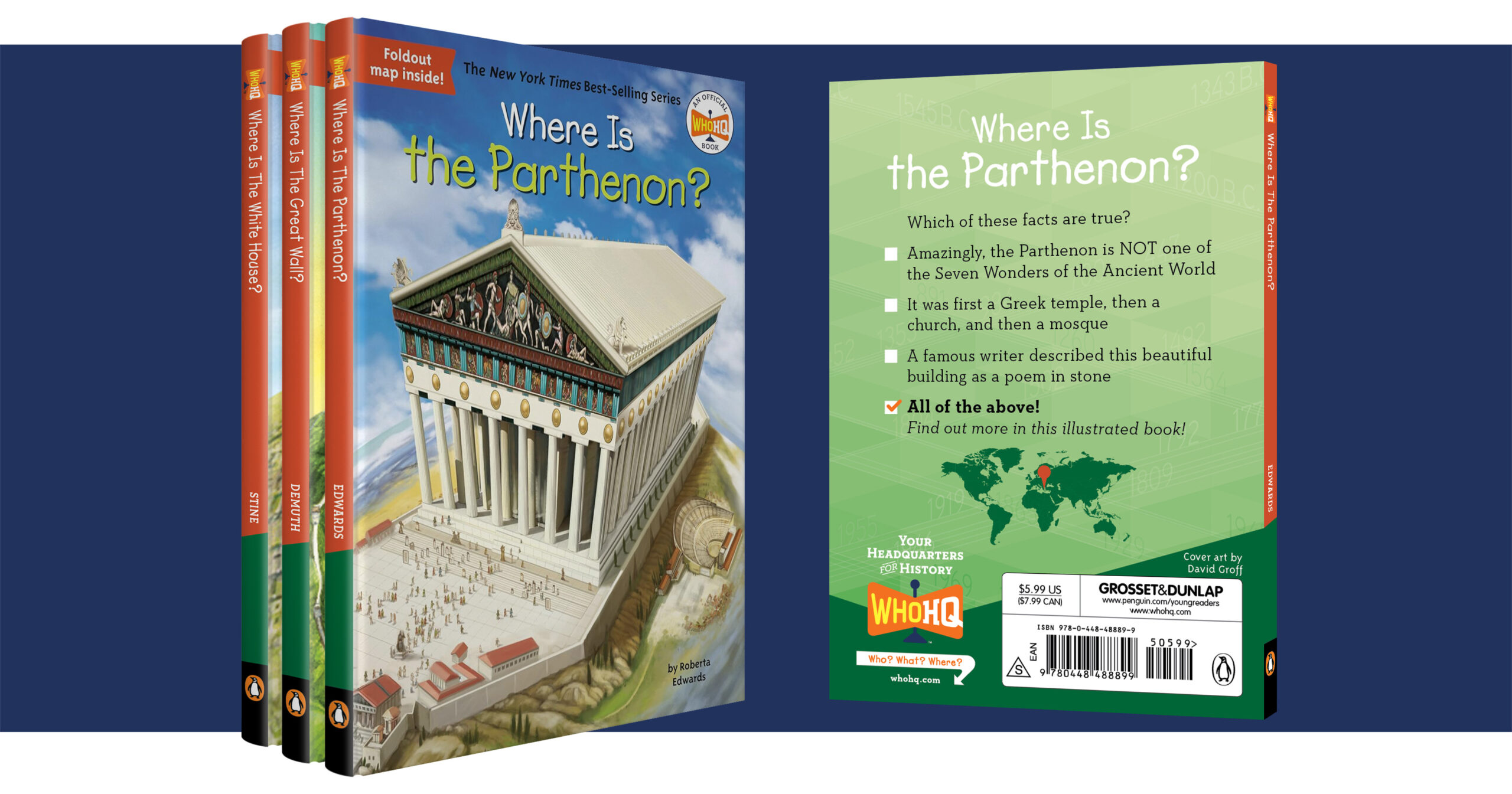
The new brand was positioned as more than a book series, but as a place, manifesting in the name and new tagline “Your Headquarters for History.” Central to the idea was that the headquarters could exist wherever Who HQ lives, from online and retail stores to classrooms and libraries. The logo was designed to suggest directional signage and a flagpole, further reinforcing the idea of Who HQ as a location.
Penguin Random House
Who HQ
BRAND GUIDE
From that central concept, we created the foundation of the new brand, including the brand DNA, differentiators, brand voice, and consumer and trade copy. A complete graphics palette was developed around journeys through time, with colorful, stylized timelines integrated into unique, angular patterns. It was decided that the highly appealing and recognizable “big head” illustration style of the covers would remain, while we added new color-coded branding to the covers, spines, and back covers.
“Once again, SJI hit it out of the park! I couldn’t have thought of stronger, more capable hands to entrust with building a brand narrative around our best-selling non-fiction series. SJI brought together a stellar team to deliver a smart and engaging destination from which we can continue to expand our brand across multiple platforms.” Daniel Moreton Associate Publisher, Penguin Group USA
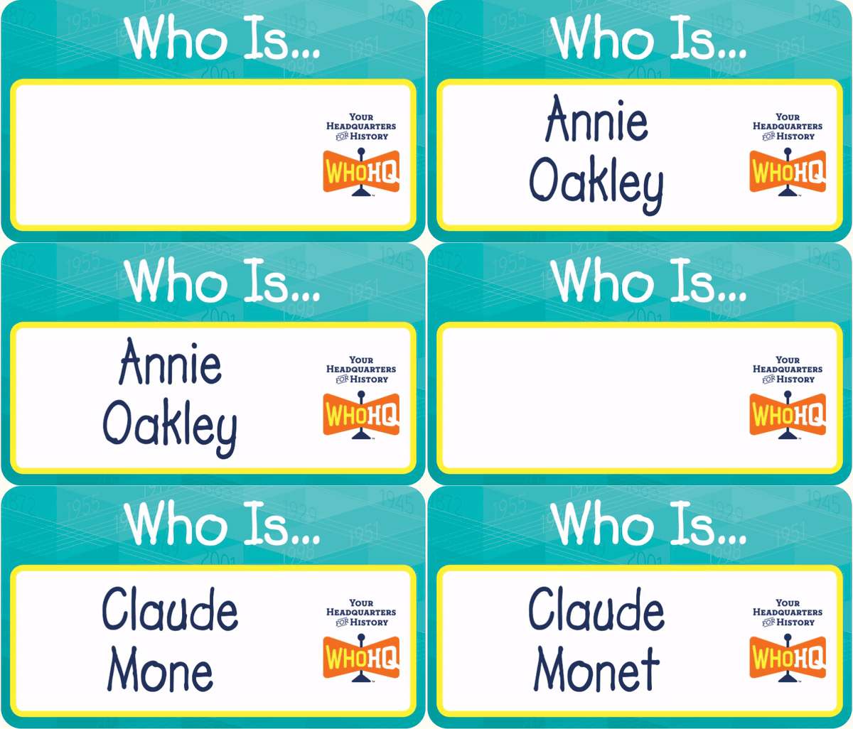
POINT-OF-SALE, WEBSITE, AND AMAZON STOREFRONT
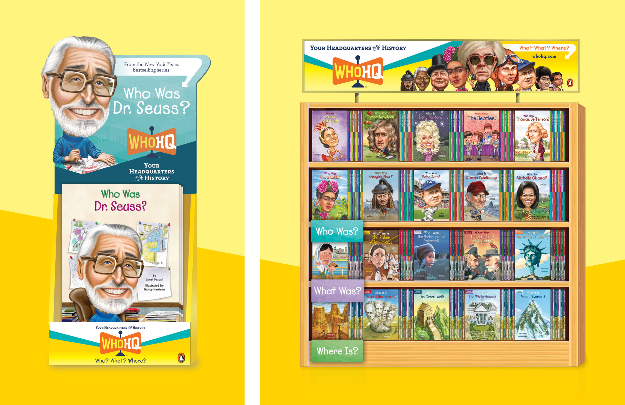
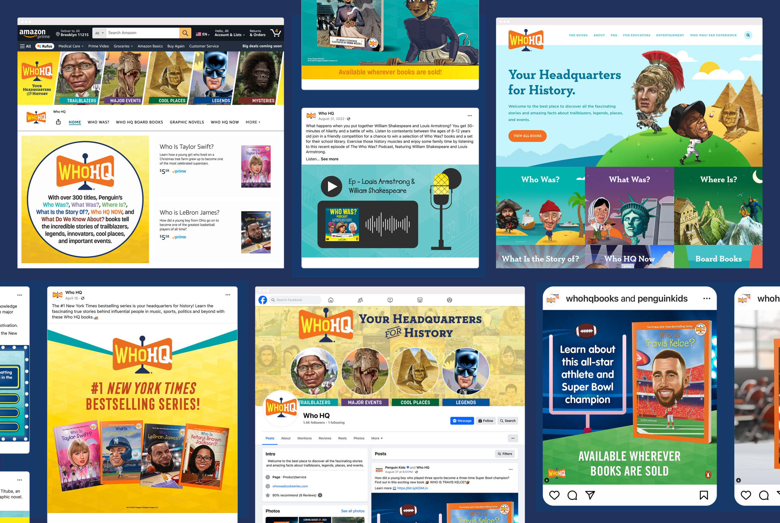
Point-of-sale materials were created using bright, engaging graphics to encompass the range of books under the Who HQ name. Penguin then adopted the new brand guidelines for a redesigned website, the Amazon online storefront, and all other digital touchpoints.
