NAMING AND GRAPHIC IDENTITY
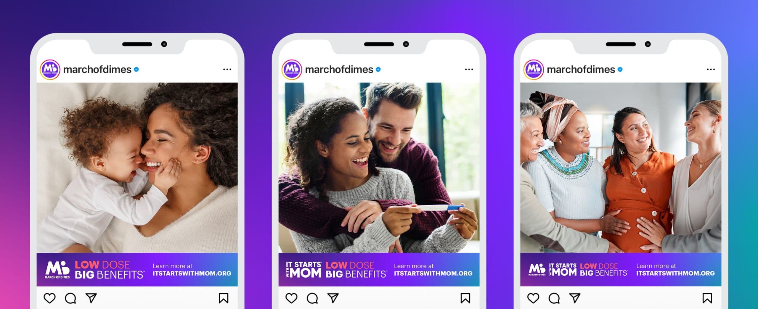
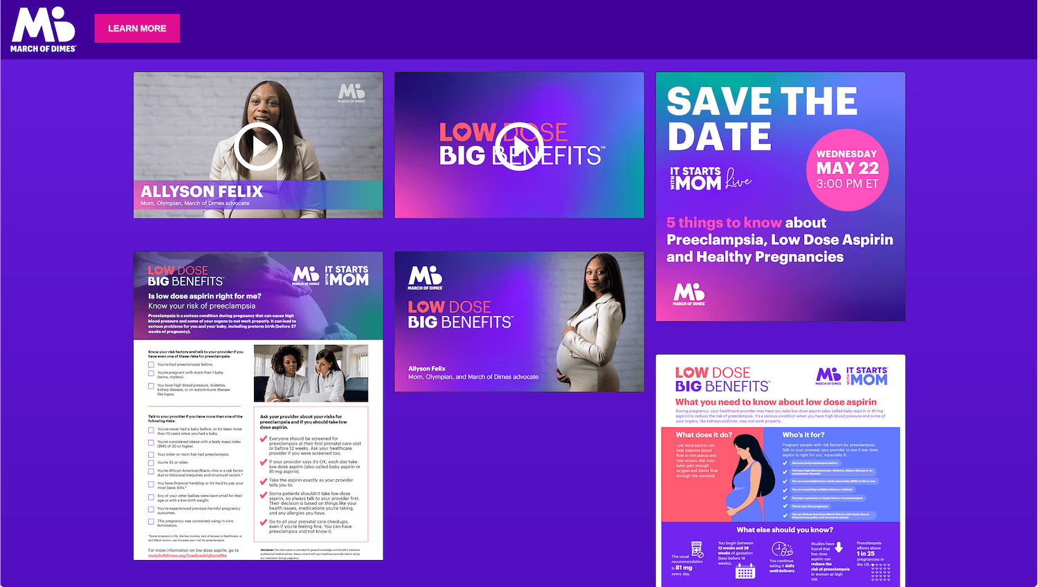
From our initial exploration, the very best of these were consumer-tested by our research partner, Matt George, before a final name was chosen: Low Dose, Big Benefits. This name succeeded in acting as a friendly, memorable hook that drew in audiences and led straight into our key messaging.
With a campaign name in hand, our design team did an extensive graphic exploration of different Low Dose, Big Benefits logos, delving into different typography, layouts, and iconography. Paramount to the exploration was that the logo needed to quickly add important context to the campaign name while being flexible enough to work across a wide range of tactics—and locked up with a variety of other logos. The final logo utilized typography that complemented the existing March of Dimes and It Starts with Mom logos, incorporating heart and pregnancy icons that added character while reinforcing the core campaign messaging.


